CASE STUDY
CANVAS
LEARNING MANAGEMENT SYSTEM
Redesigning Canvas to solve usability issues faced by faculty and students.
Role : UX Researcher & Designer

INTRODUCTION
About the Project
This project focused on enhancing the user experience of Canvas Instructure, a widely used learning management system ( LLM). The goal was to uncover the core usability challenges faced by students and faculty and to propose focused design solutions that address the real-world frsutrations.
GET STARTED
Overview
Over 30 Million people use Canvas Instructure world-wide. Through extensive research, ideation, and iterative design, we aimed to create a solution that simplifies navigation and reduces friction for users.
The Story
We began by speaking with both students and instructors to uncover common pain points in their daily use of Canvas. Our research revealed several usability challenges, leading us to propose five distinct solution ideas, each addressing a specific issue.
After evaluating user feedback, we identified one critical user flow—[Insert flow name]—that consistently caused confusion. We prioritized this flow for high-fidelity prototyping and user testing to ensure our solution directly addressed the most pressing need.

| Problem Space
Canvas offers a wide range of features—but that breadth often comes at the cost of clarity and ease of use. Students struggle to find feedback, track deadlines, and understand where key course content lives. Instructors face challenges managing their course layouts and ensuring information is communicated clearly.
Target User
Faculty
Students
Management Staff
Design Citeria
Clarity & Visibility
Consistency
User Control & Navigation
Prioritization of Tasks
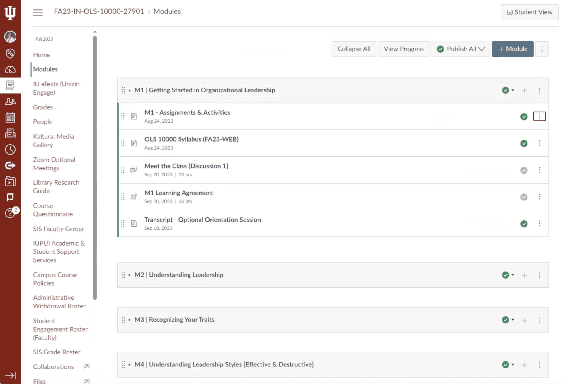
| Glimpse of Solution
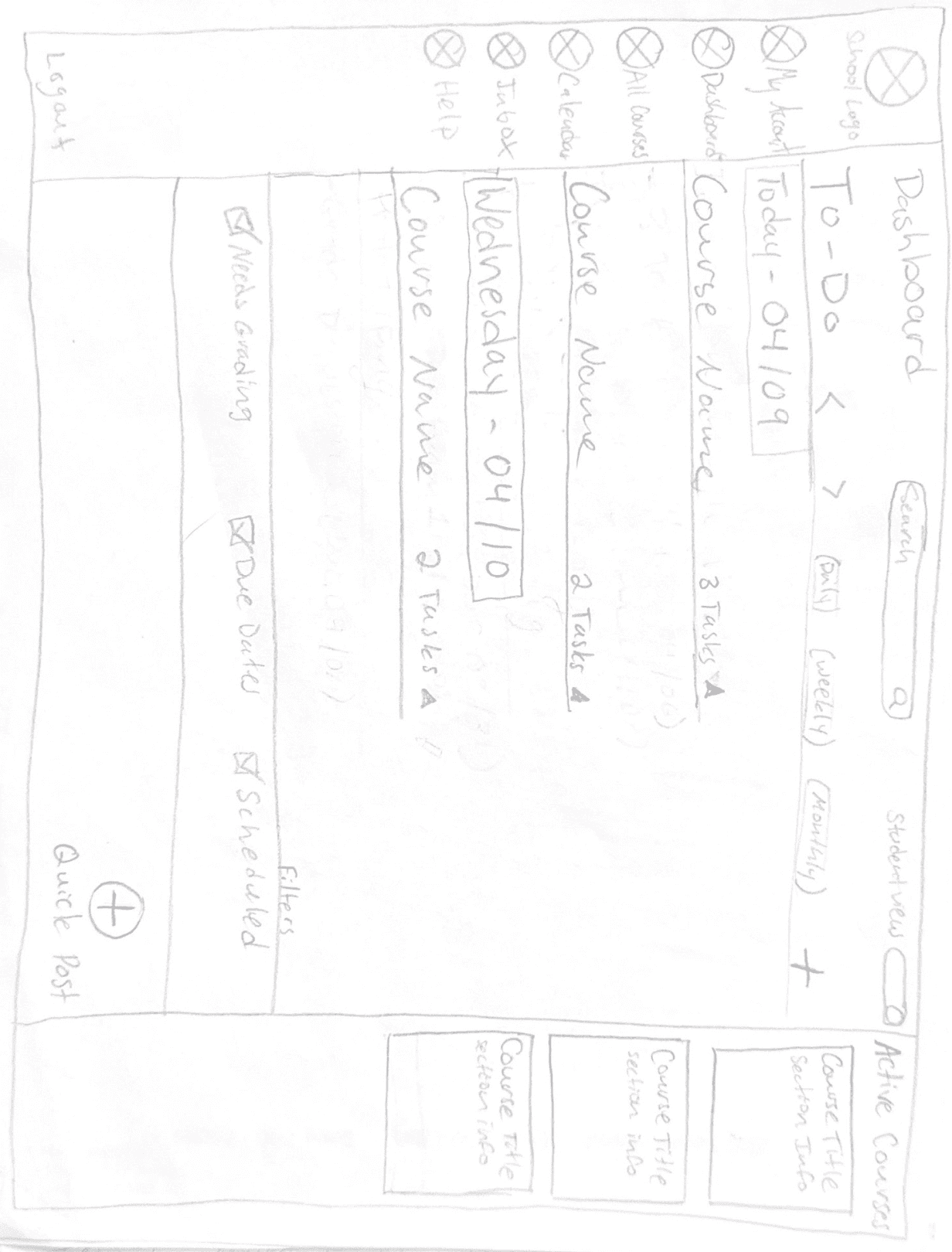
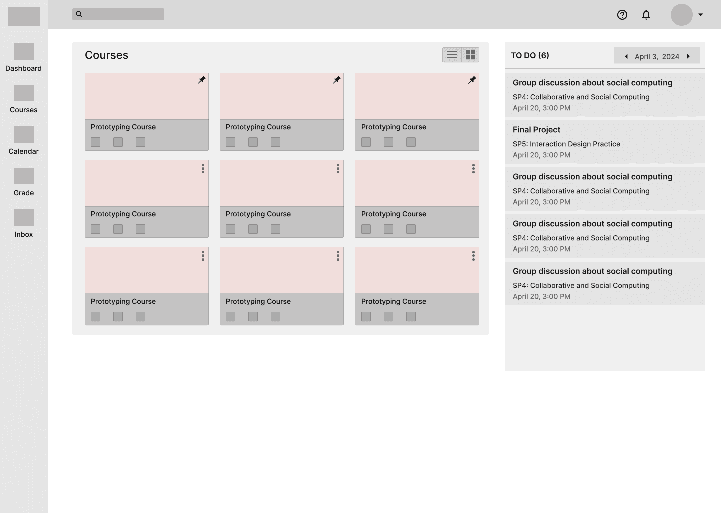
DASHBOARD
Streamlining the dashboard by enhancing the visibility of the TO-DO list and removing announcements from it to improve clarity and organization.
EXISTING SCREEN

REDESIGNED SCREEN

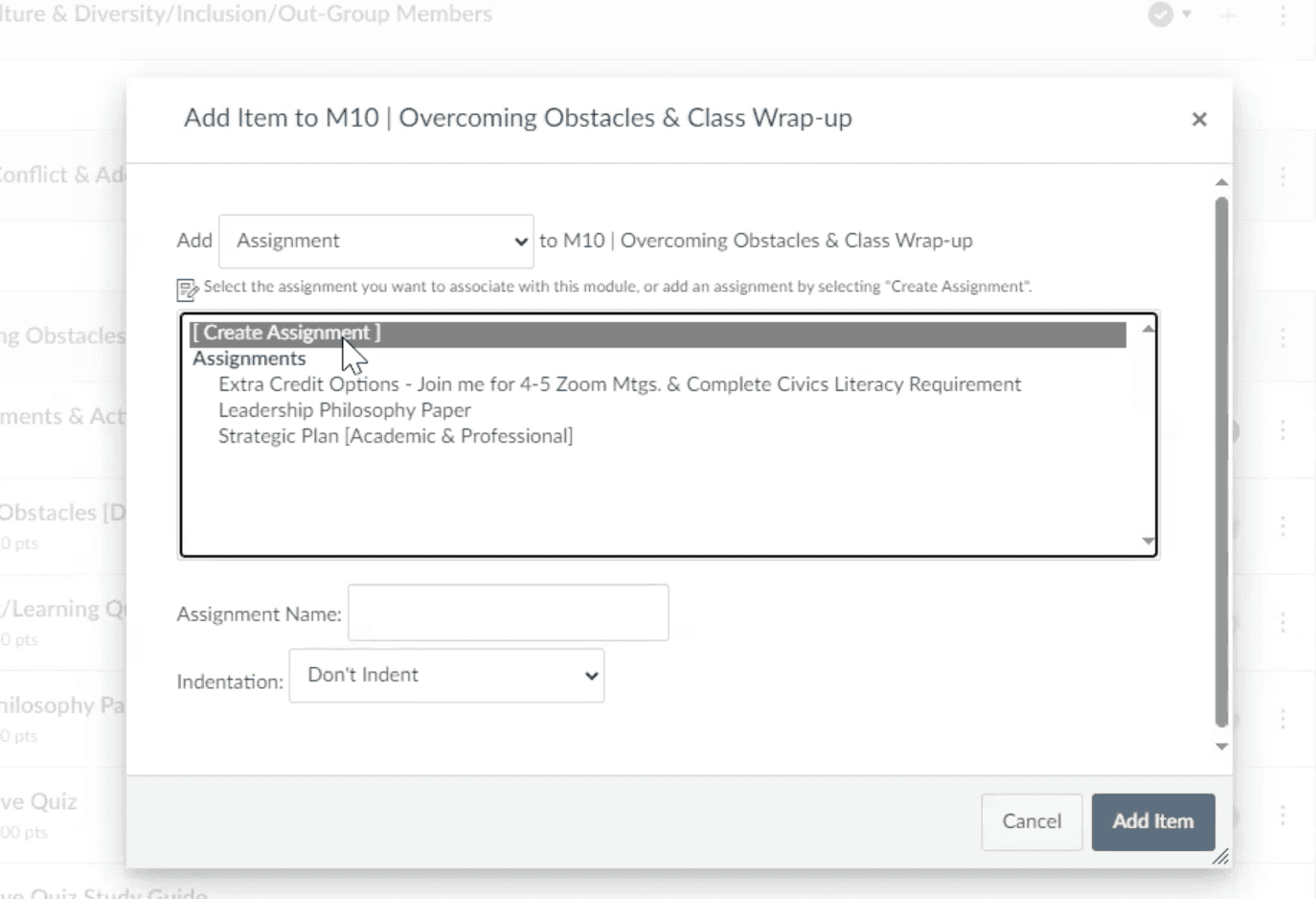
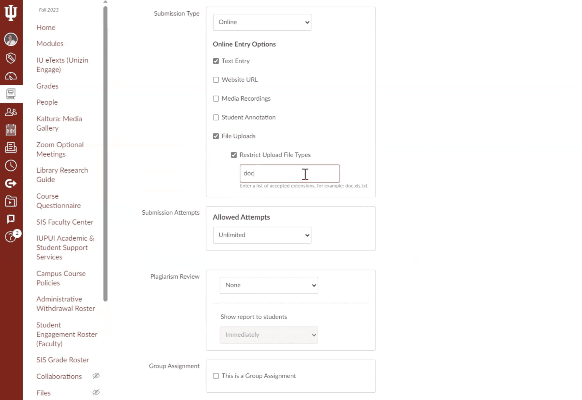
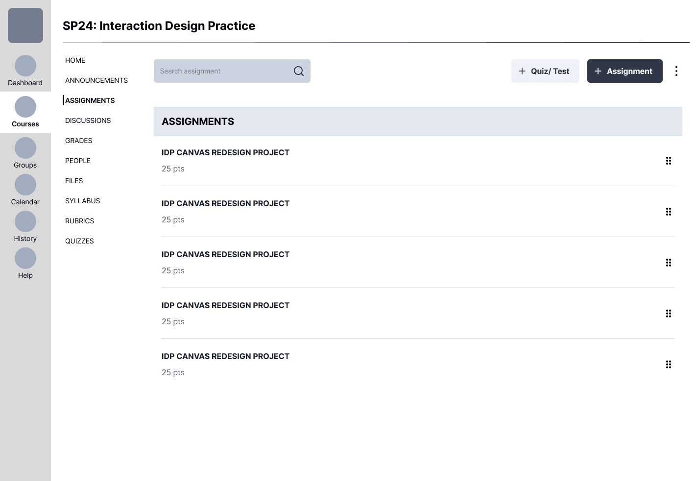
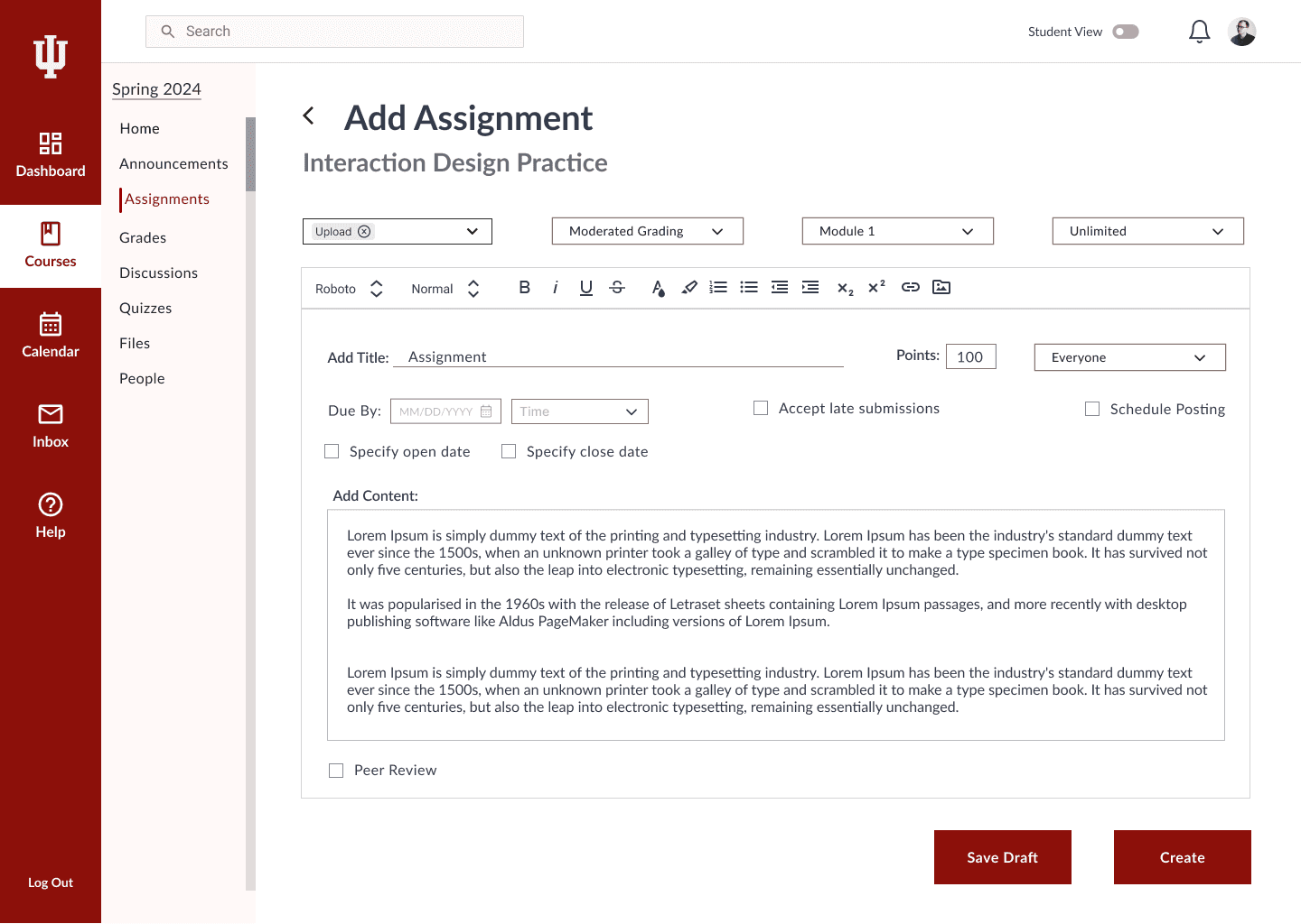
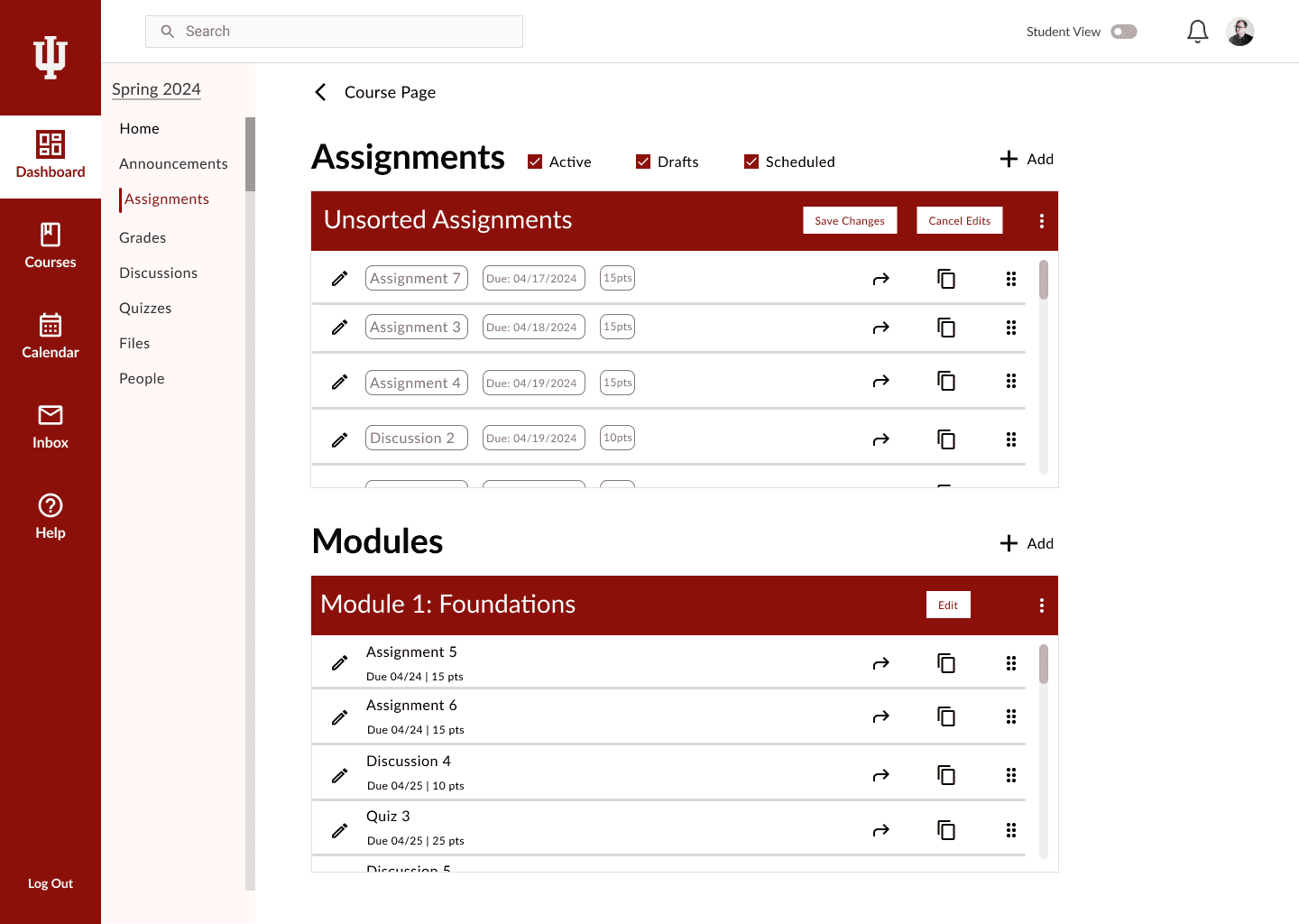
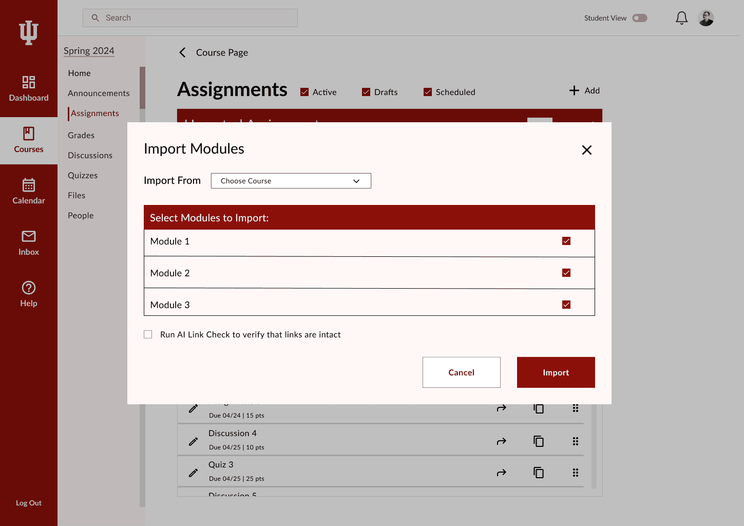
ASSIGNMENTS
Simplified the assignment creation process by reducing excessive customization options and eliminating the need to scroll. The redesigned screen presents all essential elements in a single, well-organized view.
EXISTING SCREEN

REDESIGNED SCREEN

RESEARCH
| Survey Insights
A survey form was sent out to a total of 1084 faculty and staff members of Indiana University Purdue University Indianapolis (IUPUI) , to gather information for early insights and personas.
The survey also helped in getting participants for interviews and observations.
NO. OF SURVEY PARTICIPANTS - 79

RESEARCH
| Interview Insights
We conducted interviews with students and faculty to understand how they use Canvas, what works well, and what causes frustration. Our questions focused on daily usage patterns, task difficulty, platform preferences (mobile vs. desktop), integration with other tools, and accessibility concerns.
NO. OF INTERVIEW PARTICIPANTS - 30
INSIGHTS FROM FACULTY INTERVIEWS
Assignments and Modules
75 % participants
"Setting up modules and assignments is tedious, involving many steps and unnecessary details."
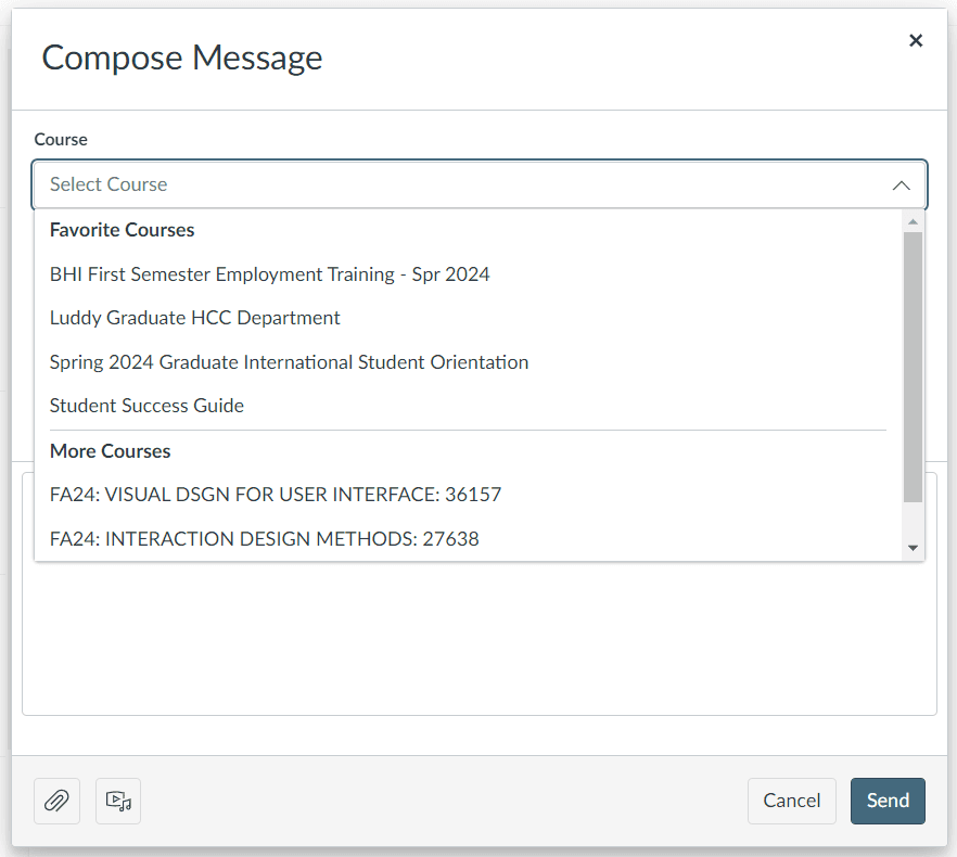
Inbox
60 % participants
"Using the Inbox for messaging is time-consuming and lacks basic formatting options."
Groups
55 % participants
“Creating groups and group assignments involves a lot of steps, and jumping from page to page.”
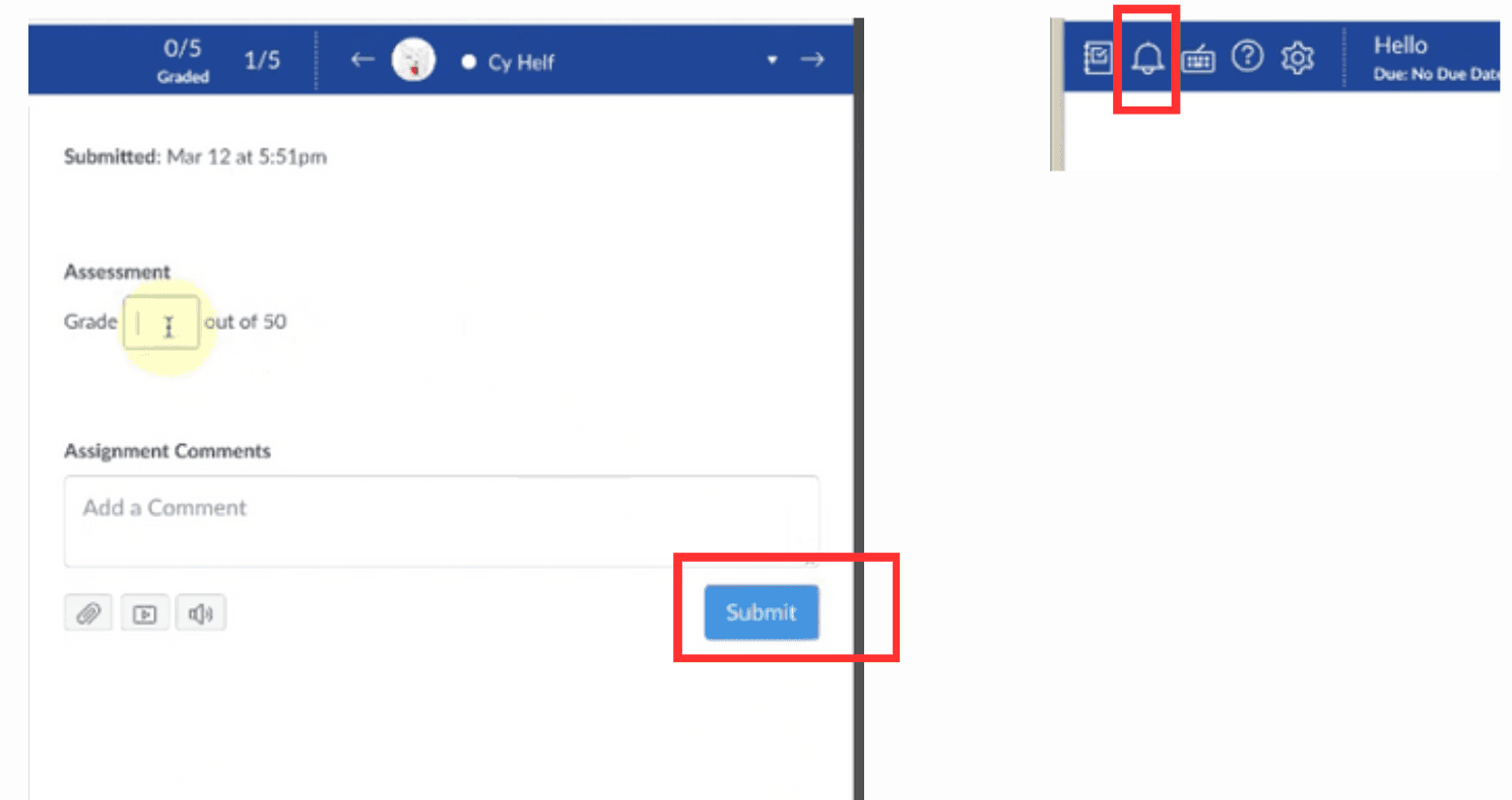
Grading
40 % participants
"Gradebook lacks a backup feature. A library of comments for student feedback would be beneficial."
INSIGHTS FROM STUDENT INTERVIEWS
Grades
50 % participants
"Rubrics should explain averages. Monthly grade graphs would show class standing."
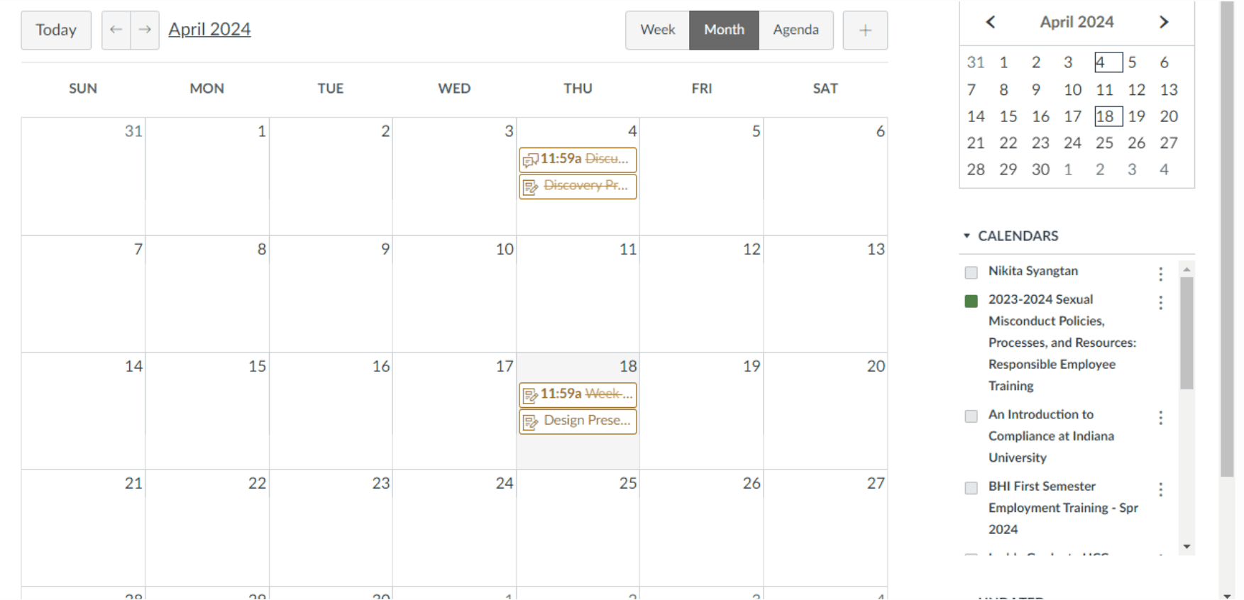
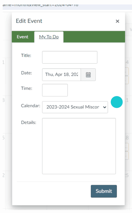
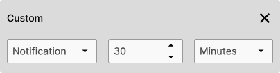
Calendar / to do
70 % participants
“Calendar can be more functional like google calendar. To-do list doesn’t even have reminder options”
Inbox
75% participants
‘’Inbox is cluttered and confusing to use.”
RESEARCH
| Observation Insights
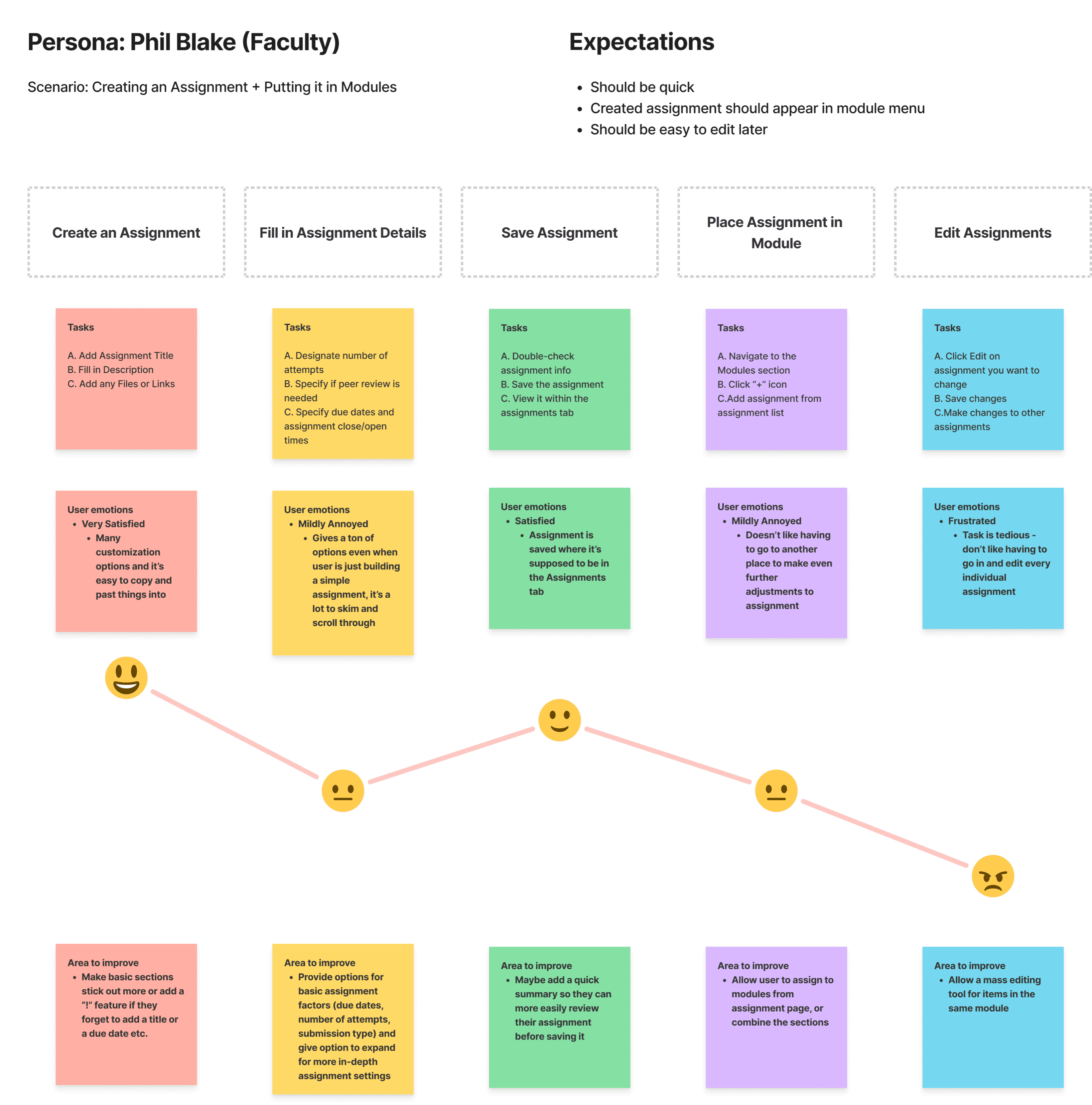
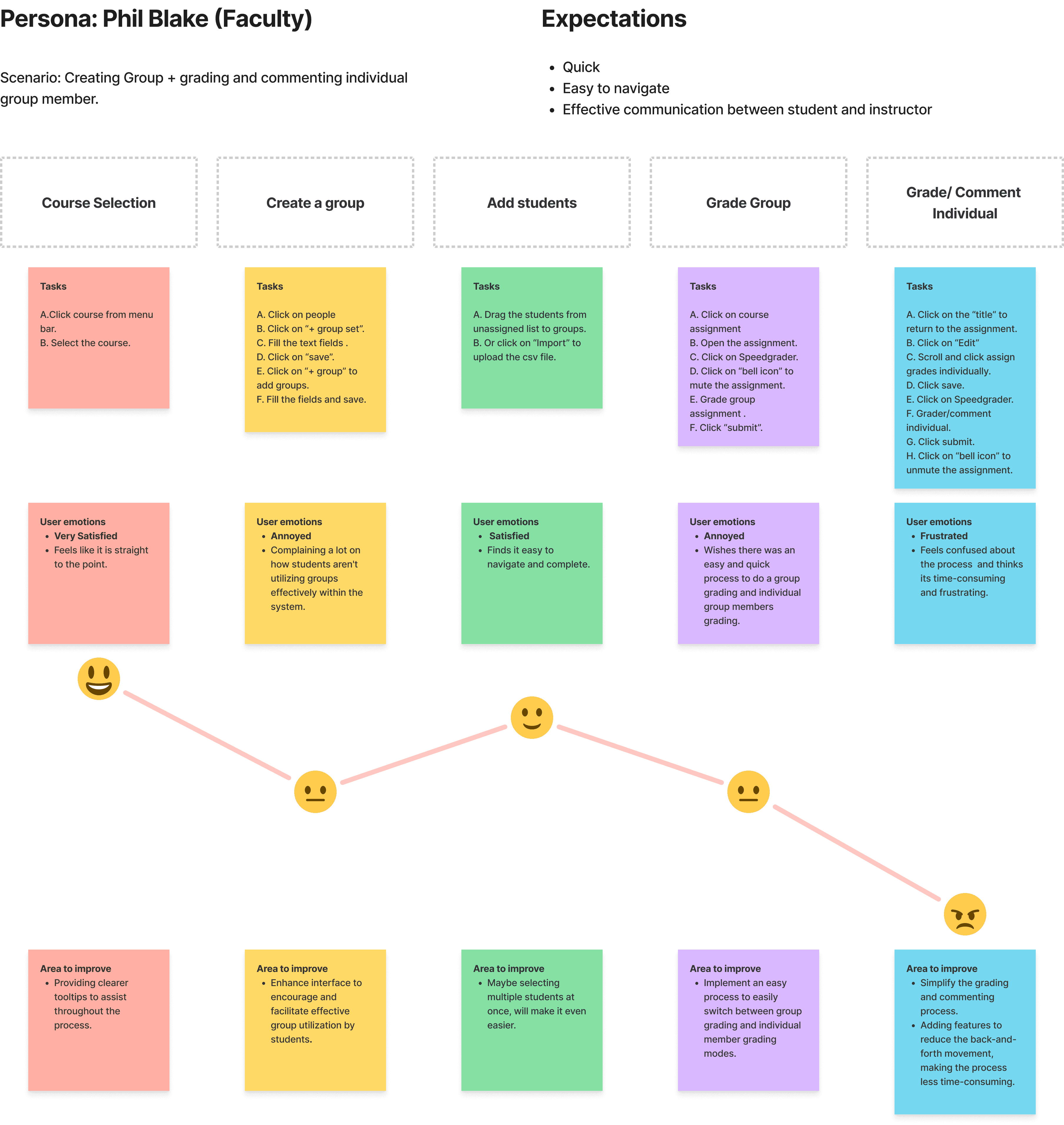
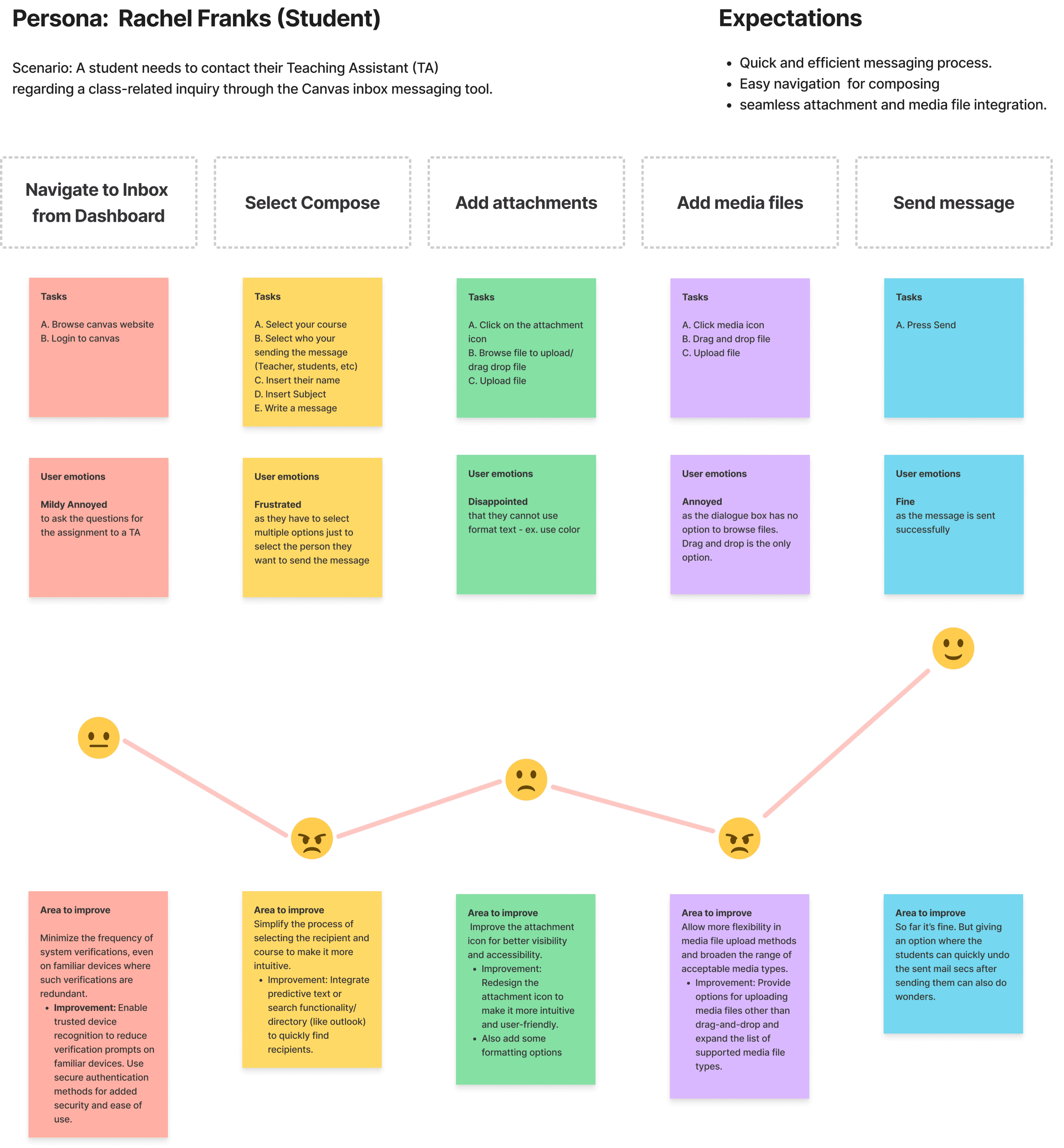
We observed students as they completed common Canvas tasks (e.g., checking grades, messaging professors). These sessions revealed real-time struggles and navigation issues. Based on our findings, we created user journey maps to highlight pain points and opportunities for improvement.
USER JOURNEY MAP FOR FACULTY
USER JOURNEY MAP FOR STUDENTS


VISITING EXISTING SCREENS
| Original Design
We closely examined the existing Canvas interface by mapping out key user flows based on real tasks performed by students and faculty. Through a combination of user interviews, task-based observations, and heuristic analysis, we identified 5 core workflows that caused the most friction


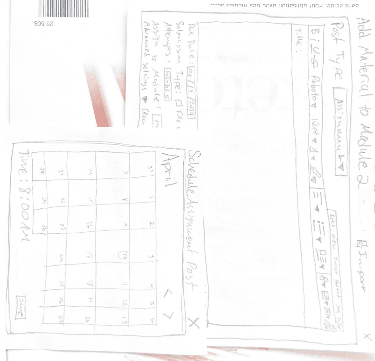
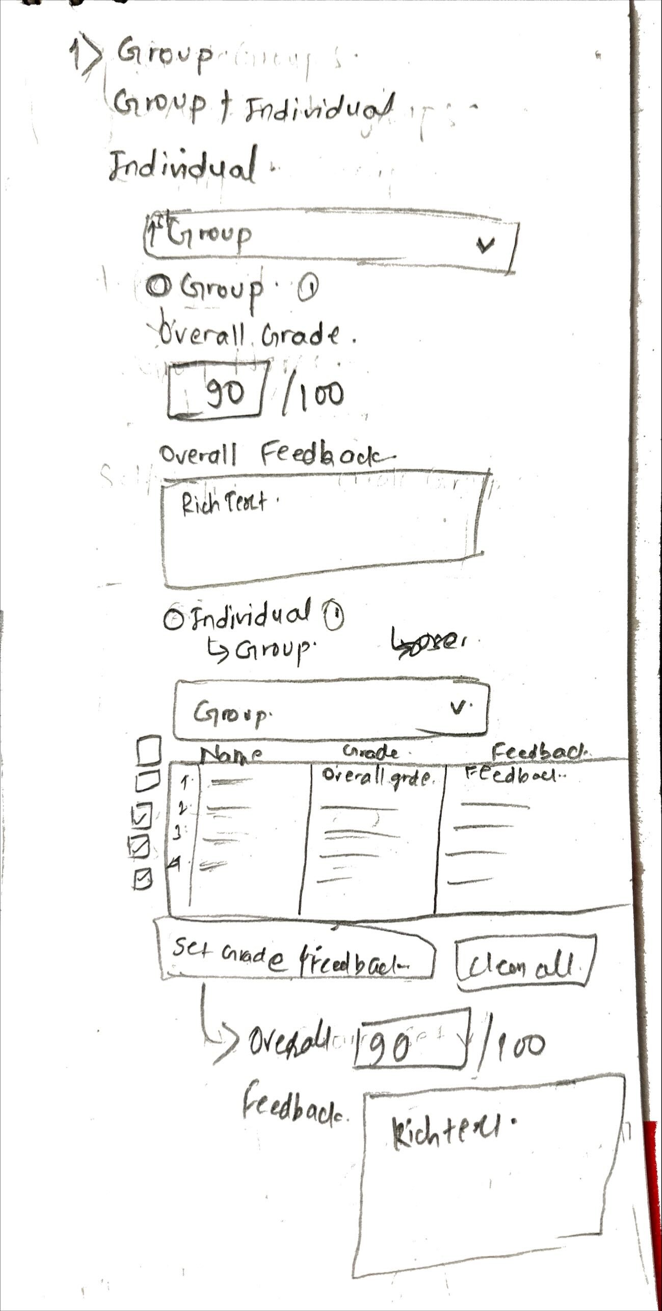
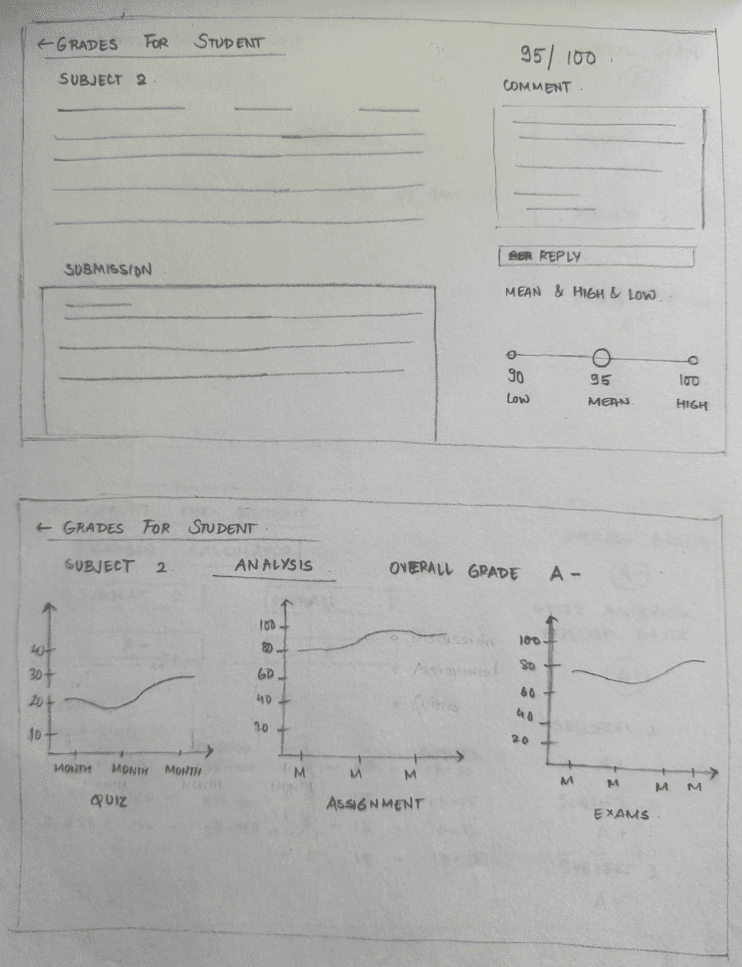
SKETCHES
| Brainstorming and Ideation
We began by sketching out quick ideas for each of the five key user flows. This helped us explore layout options, align as a team, and rapidly iterate before moving into wireframes. These early sketches guided our low-fidelity designs and ensured we focused on usability from the start.


DESIGN
| Low Fidelity
We created low-fidelity wireframes for all five flows to quickly test structure and usability. This helped us compare ideas, gather early feedback, and identify the most impactful flow to take forward.


DESIGN
| High Fidelity
Before moving to high-fidelity, we chose to focus on the Assignments & Modules flow. Faculty members spend significantly more time on Canvas than students, and through our interviews, we discovered that every faculty participant faced recurring issues when creating assignments and organizing modules. This was a major pain point—and an opportunity to create meaningful impact.


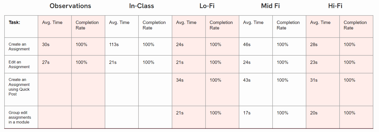
TESTING
| User Testing
Through our Redesigning of the Assignment and Modules Section of the Canvas Website - We found a decrease in the average time taken by the users to perform the tasks.
We received positive feedbacks on our design by the users . They stated that the follow is now simplified and more intuitive.